Finding and playing with peaks in RMINC
Contents
So, peaks. When producing a statistical map, it’s good to get a report of the peaks (i.e. most significant findings). RMINC has had this support for a while now, though it has remained somewhat hidden. Here’s a bit of an intro, then.
I will walk through the example we used from the Mouse Imaging Summer School in 2017, which is data from this paper:
de Guzman AE, Gazdzinski LM, Alsop RJ, Stewart JM, Jaffray DA, Wong CS, Nieman BJ. Treatment age, dose and sex determine neuroanatomical outcome in irradiated juvenile mice. Radiat Res. 2015 May;183(5):541–9.
To keep it simple, however, I’ll only look at sex differences in that dataset for now.
Let’s start - load the libraries and read in the csv file that describes the data.
suppressMessages(library(RMINC))
gf <- read.csv("/hpf/largeprojects/MICe/jason/MISS2017/intro-stats/fixed_datatable_IRdose.csv")
And run a linear model relating the Jacobian determinants to sex and radiation dose. I’ll use the segmentations file as a mask; it’ll be needed later on anyway.
labelFile <- "/hpf/largeprojects/MICe/jason/MISS2017/intro-stats/atlas-registration/pipeline-18-08-2017-at-07-08-48_processed/nlin-3/voted.mnc"
vs <- mincLm(Jacobfile_scaled0.2 ~ Sex + Dose, gf, mask = labelFile)
## Method: lm
## Number of volumes: 41
## Volume sizes: 152 320 225
## N: 41 P: 3
## In slice
## 0 1 2 3 4 5 6 7 8 9 10 11 12 13 14 15 16 17 18 19 20 21 22 23 24 25 26 27 28 29 30 31 32 33 34 35 36 37 38 39 40 41 42 43 44 45 46 47 48 49 50 51 52 53 54 55 56 57 58 59 60 61 62 63 64 65 66 67 68 69 70 71 72 73 74 75 76 77 78 79 80 81 82 83 84 85 86 87 88 89 90 91 92 93 94 95 96 97 98 99 100 101 102 103 104 105 106 107 108 109 110 111 112 113 114 115 116 117 118 119 120 121 122 123 124 125 126 127 128 129 130 131 132 133 134 135 136 137 138 139 140 141 142 143 144 145 146 147 148 149 150 151
## DoneSome more data preparation: read in the background anatomy file …
anatFile <- "/projects/moush/lbernas/Irradiation_behaviour_project/fixed_build_masked_23mar13_nlin/nlin-3.mnc"
anatVol <- mincArray(mincGetVolume(anatFile))
… and show the results at a somewhat arbitrary threshold.
mincPlotSliceSeries(anatVol, mincArray(vs, "tvalue-SexM"), anatLow=10, anatHigh=15, low=2, high=6, symmetric = T,
                    begin=50, end=-50)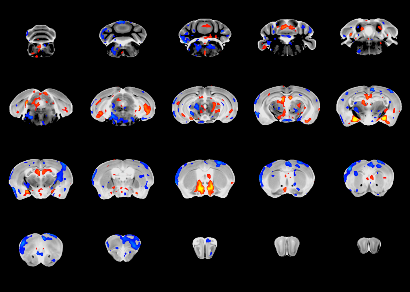
At this point we’ve run a linear model and visually assessed the results. Now we can locate the peak findings, using the mincFindPeaks command.
peaks <- mincFindPeaks(vs, "tvalue-SexM", minDistance = 1, threshold = 4)## Writing column tvalue-SexM to file /tmp/Rtmpuzd1xE/file1b495f159c51.mnc
## Range: 10.627142 -5.694668mincFindPeaks uses the find_peaks command from the MINC toolkit under the hood. You pass in the output of one of the RMINC modelling commands (mincLm in this case, but can be anything), along with the column from that model you want to get peaks from. You can then set the minimum distance between peaks (in mm) - i.e. how far apart do two statistical peaks have to be to be included? - as well as the threshold to be considered a peak. Optionally thresholds can be different for positive and negative peaks; as always, see ?mincFindPeaks for more detail.
This is what we have at this point:
peaksThere are 7 columns; the first three give the coordinates in voxel space, the next three the coordinates in world space, and then the peak value itself. There’s a further helpful command that labels the peaks with the atlas location within which the peak is located:
defsFile <- "/hpf/largeprojects/MICe/tools/atlases/Dorr_2008_Steadman_2013_Ullmann_2013_Richards_2011_Qiu_2016_Egan_2015_40micron/mappings/DSURQE_40micron_R_mapping.csv"
peaks <- mincLabelPeaks(peaks, labelFile, defsFile)
## Warning in peaks$label[i] <- mdefs$Structure[mdefs$value == peaks
## $label[i]]: number of items to replace is not a multiple of replacement
## length
## Warning in peaks$label[i] <- mdefs$Structure[mdefs$value == peaks
## $label[i]]: number of items to replace is not a multiple of replacement
## length
## Warning in peaks$label[i] <- mdefs$Structure[mdefs$value == peaks
## $label[i]]: number of items to replace is not a multiple of replacement
## length
## Warning in peaks$label[i] <- mdefs$Structure[mdefs$value == peaks
## $label[i]]: number of items to replace is not a multiple of replacement
## length
## Warning in peaks$label[i] <- mdefs$Structure[mdefs$value == peaks
## $label[i]]: number of items to replace is not a multiple of replacement
## lengthThis adds an extra column containing the name of the label for each peak:
peaksAt this point you have all the info about the most significant peaks in the dataset. There is one additional useful command, a shortcut to plot each peak. Plotting the two most positive and the two most negative peaks, for example:
opar <- par(mfrow=c(2,2), mar=c(0,0,0,0))
nP <- nrow(peaks)
for (i in c(1:2, nP:(nP-1))) {
  mincPlotPeak(peaks[i,], anatVol, mincArray(vs, "tvalue-SexM"), anatLow=10, anatHigh=15, low=2, high=6, symmetric=T)
}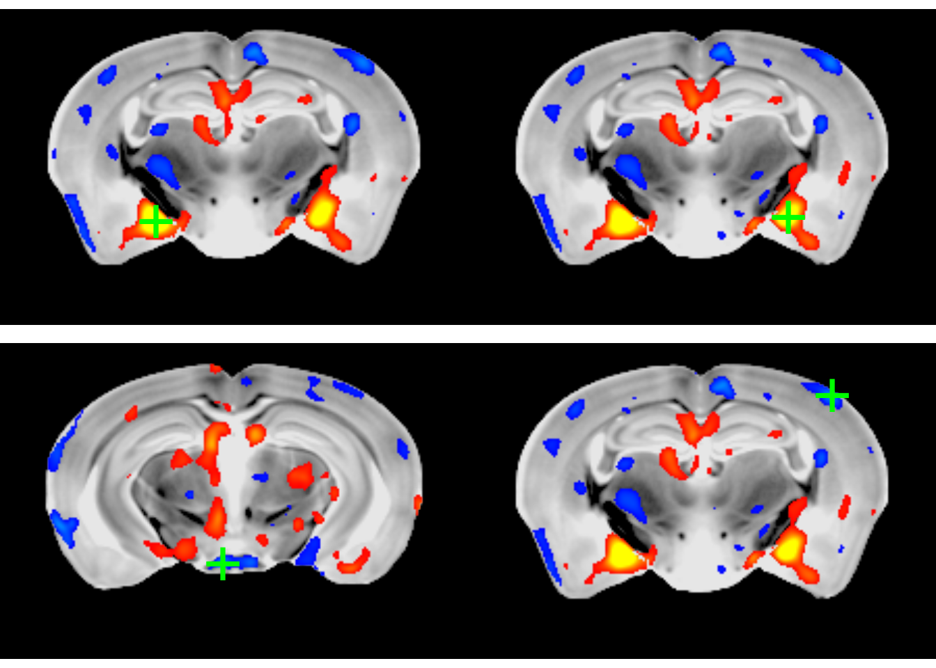
par(opar)There is an additional argument to mincPlotPeak - a function to create a plot of the peak. This is illustrated below:
# load ggplot2 for plotting
library(ggplot2)
# the plotting function; needs to take a single argument, the peak
p <- function(peak) {
  # read in the data for that particular peak
  gf$voxel <- mincGetWorldVoxel(gf$Jacobfile_scaled0.2, peak["x"], peak["y"], peak["z"])
  # and create a box-plot; also read in info from the peak for a meaningful title
  ggplot(gf) + aes(x=Sex, y=exp(voxel)) + geom_boxplot() +
    ggtitle(paste("Peak:", peak["label"]), subtitle = paste("T statistic:", peak["value"]))
}
# and plot the peak with its plot
mincPlotPeak(peaks[1,], anatVol, mincArray(vs, "tvalue-SexM"), anatLow=10, anatHigh=15, low=2, high=6,
             symmetric=T, plotFunction = p)
## Don't know how to automatically pick scale for object of type mincVoxel/vector. Defaulting to continuous.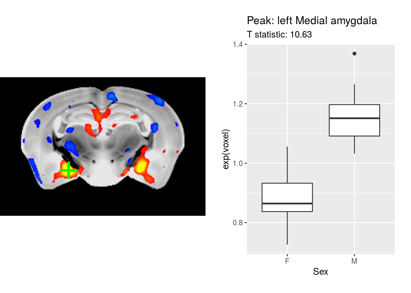
And that’s it. A quick survey for how to extract peaks, view them in a table, and create figures of the most significant findings.