Linear Models
Contents
Preamble
The purpose of this post is to elucidate some of the concepts associated with statistical linear models.
Let’s start by loading some libraries.
library(ggplot2)
library(datasets)
Background Theory
The basic idea is as follows:
Given two variables, \(x\) and \(y\), for which we’ve measured a set of data points \(\{x_i, y_i\}\) with \(i = 1, ..., n\), we want to estimate a function, \(f(x)\), such that
\[y_i = f(x_i) + \epsilon_i\]
for each data point \((x_i,y_i)\). Here \(\epsilon_i\) is the error in data point \(y_i\) compared to the predicted value \(f(x_i)\). Specifically,
\[\epsilon_i = y_i - f(x_i)\]
We don’t know \(f(x)\), but the simplest functional form that we can assume is that of a linear function:
\[f(x) = \beta_0 + \beta_1x \] where \(\beta_0\) is the intercept of the line and \(\beta_1\) is the slope associated with the variable \(x\). Thus for each data point \(x_i\), we predict a value \(\hat{y}_i = f(x_i)\) so that
\[\hat{y}_i = \beta_0 + \beta_1x_i\] This is known as simple linear regression. Having specified the form of \(f(x)\), the problem becomes one of optimizing the free parameters \(\beta_0\) and \(\beta_1\) so that the predicted or trend line best describes the real data \(\{x_i, y_i\}\). This is usually accomplished using the “ordinary least-squares” method, in which we minimize the sum of squared errors with respect to the free parameters. Explicitly, if we write the sum of squared errors as
\[\chi^2 = \sum_{i=1}^n{\epsilon_i^2} = \sum_{i=1}^n{(y_i - \hat{y}_i)^2} = \sum_{i=1}^n{(y_i - \beta_0 - \beta_1x_i)^2}\] we want to determine \(\beta_0\) and \(\beta_1\) such that
\[\frac{\partial\chi^2}{\partial\beta_0} = 0\] and \[\frac{\partial\chi^2}{\partial\beta_1} = 0\]
This can be solved analytically. In practice we let the computer do it for us.
Moving on , there’s no reason we need to restrict ourselves to one predictor for the response variable \(y\), so we can include multiple variables \(\{x_1, x_2, ..., x_N\}\) in our model. Here \(N\) is the total number of regressors that are included. This is known as multiple linear regression. The model then becomes
\[\hat{y} = \beta_0 + \sum_{a=1}^N{} \beta_ax_a\] where \(a\) is an index summing over the predictors (rather than over the data points themselves as in the expression for \(\chi^2\) above). Here I’ve expressed the model in terms of the variables, rather than individual data points. For an individual data point \(\{x_i,y_i\}\), we could write this as
\[\hat{y}_i = \beta_0 + \sum_{a=1}^N{} \beta_ax_{a,i}\] where \(x_{a,i}\) is the \(i\)th data point of the \(a\)th variable (e.g. the height, which is the variable, of a specific person). The two are identical representations. The optimization process for multiple linear regression is the same as that for simple linear regression, only involving more derivatives.
Alright that should be enough background math. In the next Section, we’ll look at this in practice.
Simple Linear Regression in Practice
We’ll be working with the mtcars dataset.
str(mtcars)## 'data.frame': 32 obs. of 11 variables:
## $ mpg : num 21 21 22.8 21.4 18.7 18.1 14.3 24.4 22.8 19.2 ...
## $ cyl : num 6 6 4 6 8 6 8 4 4 6 ...
## $ disp: num 160 160 108 258 360 ...
## $ hp : num 110 110 93 110 175 105 245 62 95 123 ...
## $ drat: num 3.9 3.9 3.85 3.08 3.15 2.76 3.21 3.69 3.92 3.92 ...
## $ wt : num 2.62 2.88 2.32 3.21 3.44 ...
## $ qsec: num 16.5 17 18.6 19.4 17 ...
## $ vs : num 0 0 1 1 0 1 0 1 1 1 ...
## $ am : num 1 1 1 0 0 0 0 0 0 0 ...
## $ gear: num 4 4 4 3 3 3 3 4 4 4 ...
## $ carb: num 4 4 1 1 2 1 4 2 2 4 ...The description of these variables can be found here. We’re going to start by looking at the relationship between two continuous variables. Specifically, I’ve chosen to examine the relationship between car weight, wt, and fuel efficiency, mpg. Let’s start by creating a scatter plot to look at how the fuel efficiency varies with car weight.
p.mpg_vs_wt <- ggplot(mtcars, aes(x=wt,y=mpg)) + geom_point()
p.mpg_vs_wt +
  labs(x = "Weight (1000 lbs)",
       y = "Miles per Gallon",
       title = "Scatter Plot of MPG vs. Weight")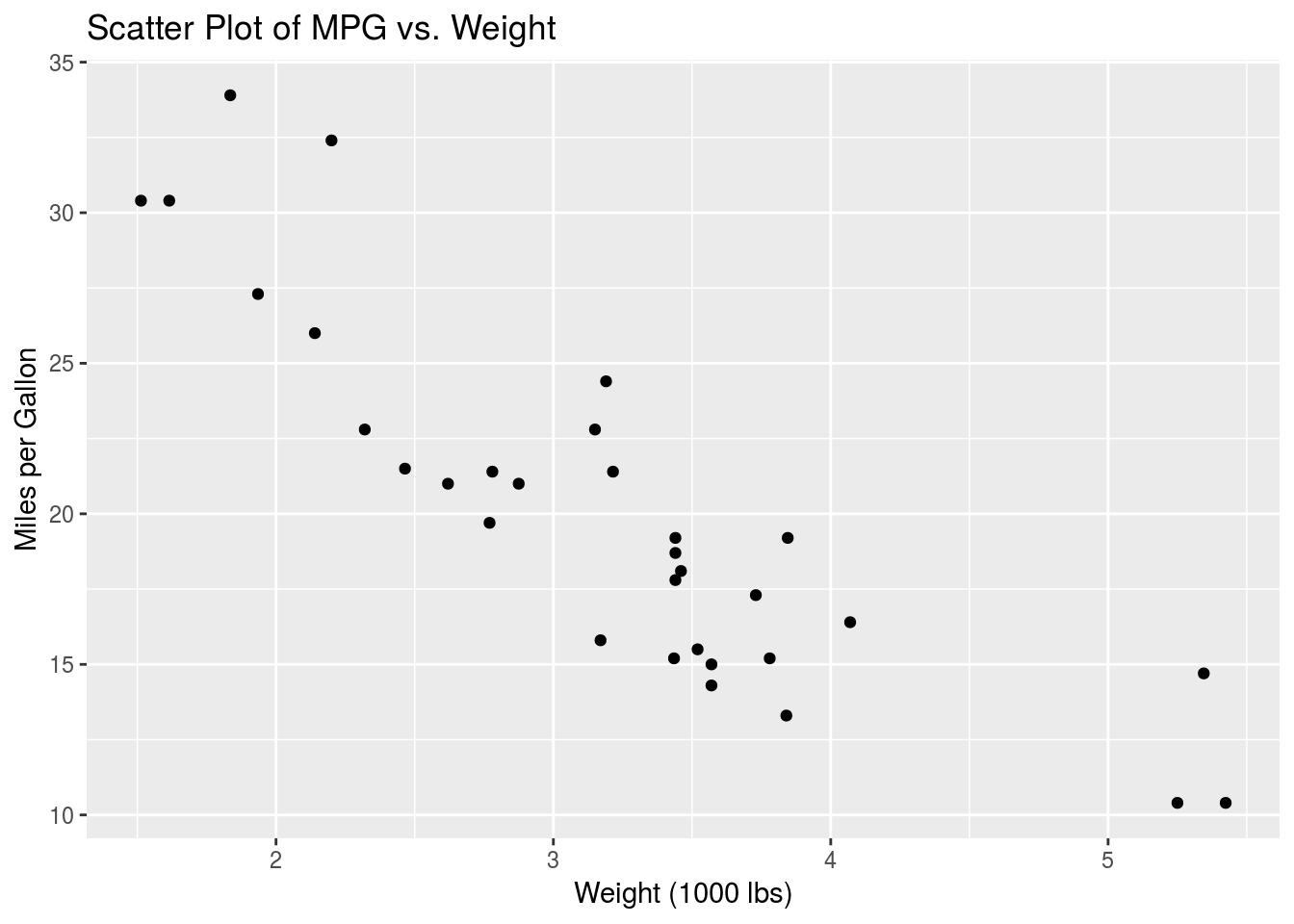
This is as we would expect, since less energy is needed to move lighter cars. Moreover we suspect that this data might be well suited to a simple linear model. As described above, the model we will be building is
\[y = \beta_0 + \beta_1x + \epsilon\]
or
\[\hat{y} = \beta_0 + \beta_1x\]
where \(y\) is the mpg variable in this case and \(x\) is the wt variable. In R formula notation, we can express this as mpg ~ wt, where ~ means “is modelled by”. The way to build a linear model in R is using the lm() function, as follows:
mpg_vs_wt <- summary(lm(mpg ~ wt,data=mtcars))
print(mpg_vs_wt)
##
## Call:
## lm(formula = mpg ~ wt, data = mtcars)
##
## Residuals:
## Min 1Q Median 3Q Max
## -4.5432 -2.3647 -0.1252 1.4096 6.8727
##
## Coefficients:
## Estimate Std. Error t value Pr(>|t|)
## (Intercept) 37.2851 1.8776 19.858 < 2e-16 ***
## wt -5.3445 0.5591 -9.559 1.29e-10 ***
## ---
## Signif. codes: 0 '***' 0.001 '**' 0.01 '*' 0.05 '.' 0.1 ' ' 1
##
## Residual standard error: 3.046 on 30 degrees of freedom
## Multiple R-squared: 0.7528, Adjusted R-squared: 0.7446
## F-statistic: 91.38 on 1 and 30 DF, p-value: 1.294e-10The focus of this document will be on interpreting the Estimate column of the Coefficients table. Let’s pull this table from the output:
print(mpg_vs_wt$coefficients)## Estimate Std. Error t value Pr(>|t|)
## (Intercept) 37.285126 1.877627 19.857575 8.241799e-19
## wt -5.344472 0.559101 -9.559044 1.293959e-10This is fairly straightforward to interpret. Looking at the Estimate column, the (Intercept) value describes the value of \(\beta_0\) in our model, while the wt value describes the slope associated with the wt variable, i.e. \(\beta_1\). Our fitted model looks like this:
\[\hat{y} = 37.3- 5.3x\] where \(x\) is the wt variable and \(y\) is the mpg variable, as mentioned above.
Let’s see how this looks.
p.mpg_vs_wt +
  labs(x = "Weight (1000 lbs)",
       y = "Miles per Gallon",
       title = "Simple Linear Model: MPG vs. Weight") +
  geom_abline(intercept = mpg_vs_wt$coefficients["(Intercept)","Estimate"],
              slope = mpg_vs_wt$coefficients["wt", "Estimate"]) +
  coord_cartesian(xlim=c(0,6),ylim = c(5,40))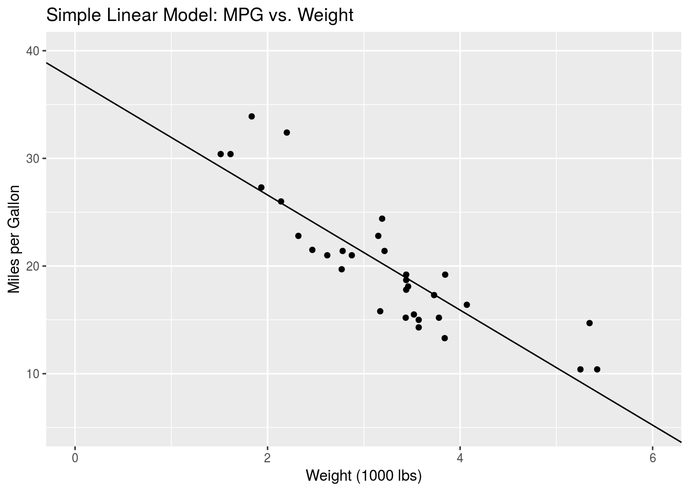
That looks pretty good. A second-order polynomial might better capture the data at the lower and higher wt values, but we won’t go into that here.
Simple Linear Regression with Categorical Variables
In the previous Section, we looked at how simple linear regression works when the predictor is a continuous variable, like wt. Here we will examine what happens when we model categorical variables. Recall that a categorical variable is a variable that takes on discrete, usually non-numerical, values. For example, sex is a categorical variable, with the values being male or female.
In the mtcars dataset, we’ll look at the am variable, which describes whether the car has manual or automatic transmission. Let’s explicitly express this as a factor and display the unique values.
mtcars$am <- as.factor(mtcars$am)
unique(mtcars$am)
## [1] 1 0
## Levels: 0 1So am has two possible values. Manual transmission is encoded as am = 1 while automatic transmission is encoded as am = 0 (refer to the dataset description). As we did above, we can examine how wt varies with the am variable. Again we are fitting a model
\[\hat{y} = \beta_0 + \beta_1A\] where \(y\) is the wt variable and \(A\) is the am variable. Keep in mind that \(A\) is binary. In R:
mpg_vs_am <- summary(lm(mpg ~ am, data=mtcars ))
print(mpg_vs_am$coefficients)
## Estimate Std. Error t value Pr(>|t|)
## (Intercept) 17.147368 1.124603 15.247492 1.133983e-15
## am1 7.244939 1.764422 4.106127 2.850207e-04Thus we see that \(\beta_0\) = 17.1 and \(\beta_1\) = 7.2. Note here that in the Coefficients table, the slope estimate is associated with the label am1. This means that it displays the slope going from am = 0 to am = 1. This is perhaps expected in this case since 1 is greater than 0, but in general categorical variables will not have numerical values. Consider again a variable describing sex. The two instances are “Male” and “Female”. There is no specific order in which to compute the slope. When building a model with categorical variables such as these, R will implicitly assign values of 0 and 1 to the levels of the variable. By default, R, assigns the reference level, i.e. a value of 0, to the value that is lowest in alphabetical order. For the sex variable, “Female” would be associated with 0, and “Male” with 1. So when running lm() on such a model and printing the output, the Coefficients table will have a row with a name like sexMale. The Estimate value associated with this describes the slope of the model going from sex=Female (which is implicitly defined as 0) to sex=Male (which is implicitly defined as 1). This might seem unnecessary right now, but it becomes important when trying to interpret the output from more complex models, as we’ll see below.
As above, we can plot this data and model.
ggplot(mtcars, aes(x=am,y=mpg)) +
  geom_jitter(width=0.1) +
  geom_smooth(method="lm", formula = y~x, aes(group=1), se=F) +
  labs(x = "Transmission (0 = automatic)",
       y = "Miles per Gallon",
       title = "Simple Linear Model: MPG vs. Transmission")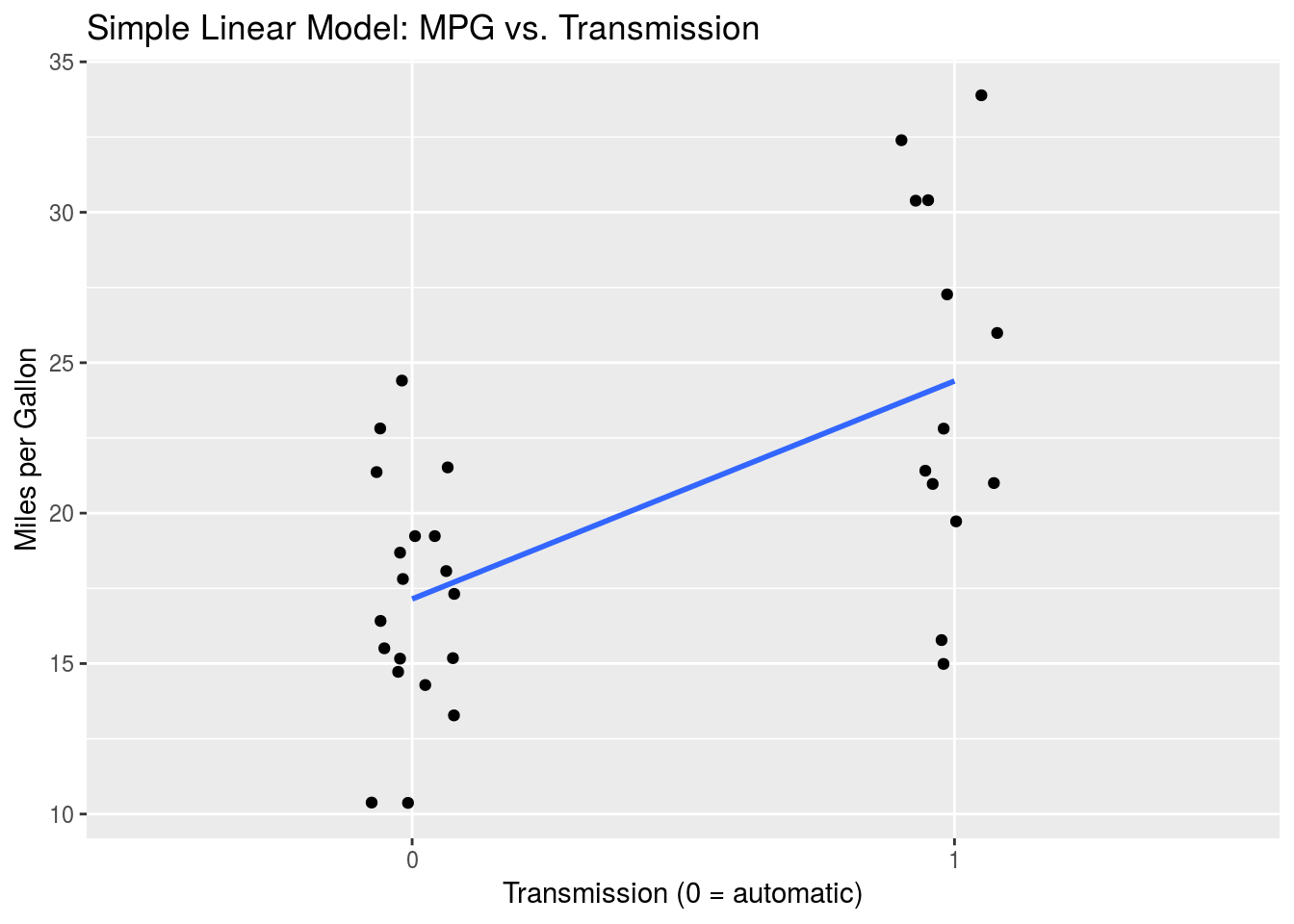
Multiple Linear Regression in Practice
In this Section we will combine the models built in the two previous Sections using multiple linear regression. Specifically, we will model mpg by wt and am together.
Let’s start by taking a look at the data.
ggplot(mtcars, aes(x=wt, y=mpg, col=am)) +
  geom_point() +
   labs(x = "Weight (1000 lbs)",
       y = "Miles per Gallon",
       title = "Fuel Efficiency, Weight, and Transmission",
       colour="Transmission")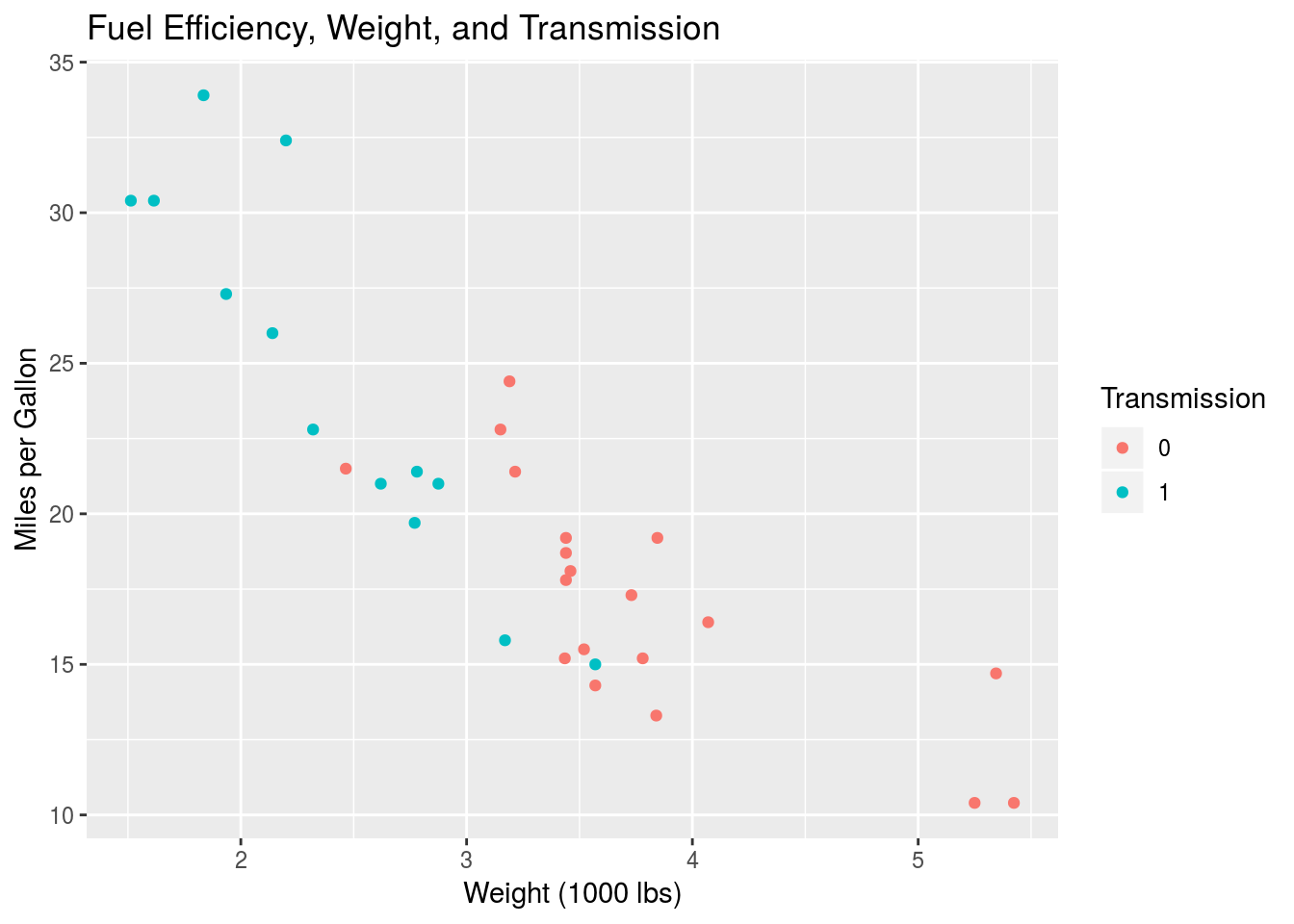
Again, I’ve plotted mpg against wt using a scatter plot, but I’ve mapped the colour aesthetic to the am variable to see the group variation.
Mathematically, the model we will use looks like
\[\hat{y} = \beta_0 + \beta_1x + \beta_2A\] where, as above, \(y\) is the mpg variable, \(x\) is the wt continuous variable, and A is the categorical am variable. \(\beta_1\) is the slope associated with \(x\) and \(\beta_2\) is the slope associated with \(A\). Recall that \(A\) is only 0 or 1.
Let’s go ahead and build the model in R.
mpg_MLR <- summary(lm(mpg ~ wt + am, data=mtcars))
print(mpg_MLR$coefficients)
## Estimate Std. Error t value Pr(>|t|)
## (Intercept) 37.32155131 3.0546385 12.21799285 5.843477e-13
## wt -5.35281145 0.7882438 -6.79080719 1.867415e-07
## am1 -0.02361522 1.5456453 -0.01527855 9.879146e-01Again, keeping in mind the mathematical formula, we see that (Intercept) corresponds to \(\beta_0\) = 37.32, wt corresponds to \(\beta_1\) = -5.35 and am1 corresponds to \(\beta_2\) = -0.02. So how do we interpret this? How could we sketch this model on a scatter plot of \(y\) vs \(x\) like the one above? The way to go about it is to examine the two cases for our categorical variables \(A\) = am. Recall that, regardless of what our factor levels are (0/1, Female/Male), R always encodes categorical variables as 0 and 1. Consequently we can always examine our mathematical model by setting the corresponding variable to 0 or 1. For \(A\) = am = 0, we have
\[\hat{y} = \beta_0 + \beta_1x\] In this case, when \(A\) = 0, \(\beta_0\) is the intercept of the line relating \(x\) and \(y\), and \(\beta_1\) is the slope associated with \(x\). On the scatter plot, we would draw a line with this slope and intercept. What about when \(A = 1\)?
\[\hat{y} = \beta_0 + \beta_1x + \beta_2\] \[= (\beta_0 + \beta_2) + \beta_1x\] \[= \beta_0' + \beta_1x\]
We find that we actually have a new intercept value \(\beta_0' = \beta_0 + \beta_2\), but the same slope \(\beta_1\). Thus the trend line associated with \(A = 1\) has a different intercept than that associated with \(A = 0\). What we’ve discovered is that the \(\beta_2\) parameter tells us the difference in the intercept values between the am = 0 and am = 1 groups, i.e. \(\beta_2 = \beta_0' - \beta_0\). The \(\beta_1\) parameter tells us the slope of the two lines.
Let’s see what this looks like.
beta0 <- mpg_MLR$coefficients["(Intercept)","Estimate"]
beta1 <- mpg_MLR$coefficients["wt","Estimate"]
beta0_prime <- mpg_MLR$coefficients["(Intercept)","Estimate"] +
                mpg_MLR$coefficients["am1","Estimate"]

ggplot(mtcars, aes(x = wt, y = mpg, col = am)) +
  geom_point() +
  geom_abline(intercept = beta0,
         slope = beta1,
         col="red",
         alpha=0.5) +
  geom_abline(intercept = beta0_prime,
              slope = beta1,
              col="blue",
              alpha=0.5) +
  labs(x = "Weight (1000 lbs)",
       y = "Miles per Gallon",
       title = "Multiple Linear Model: MPG ~ Weight + Transmission",
       colour="Transmission")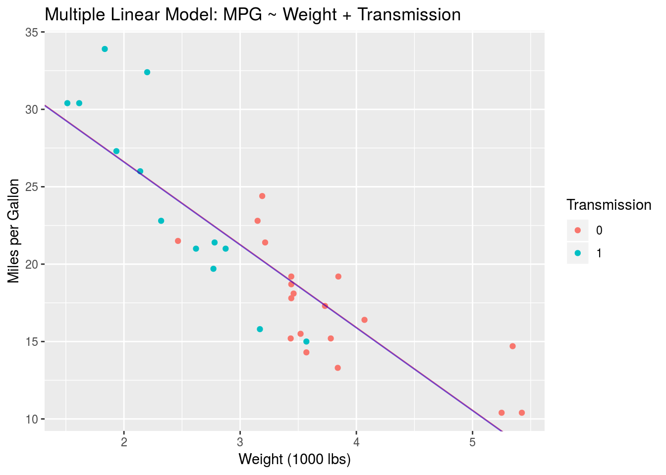
There are actually two lines in this plot, a blue one and a red one. Given how small \(\beta_2\) is we can’t see much of a difference, but the blue trend line should be slightly lower than the red line. Their slopes are the same. Let’s zoom in to be sure.
ggplot(mtcars, aes(x = wt, y = mpg, col = am)) +
  geom_point() +
  geom_abline(intercept = beta0,
         slope = beta1,
         col="red",
         alpha=0.5) +
  geom_abline(intercept = beta0_prime,
              slope = beta1,
              col="blue",
              alpha=0.5) +
  coord_cartesian(xlim = c(3.4,3.5),ylim = c(17.5,19.5)) +
    labs(x = "Weight (1000 lbs)",
       y = "Miles per Gallon",
       title = "Multiple Linear Model: MPG ~ Weight + Transmission (Zoomed In)",
       colour="Transmission")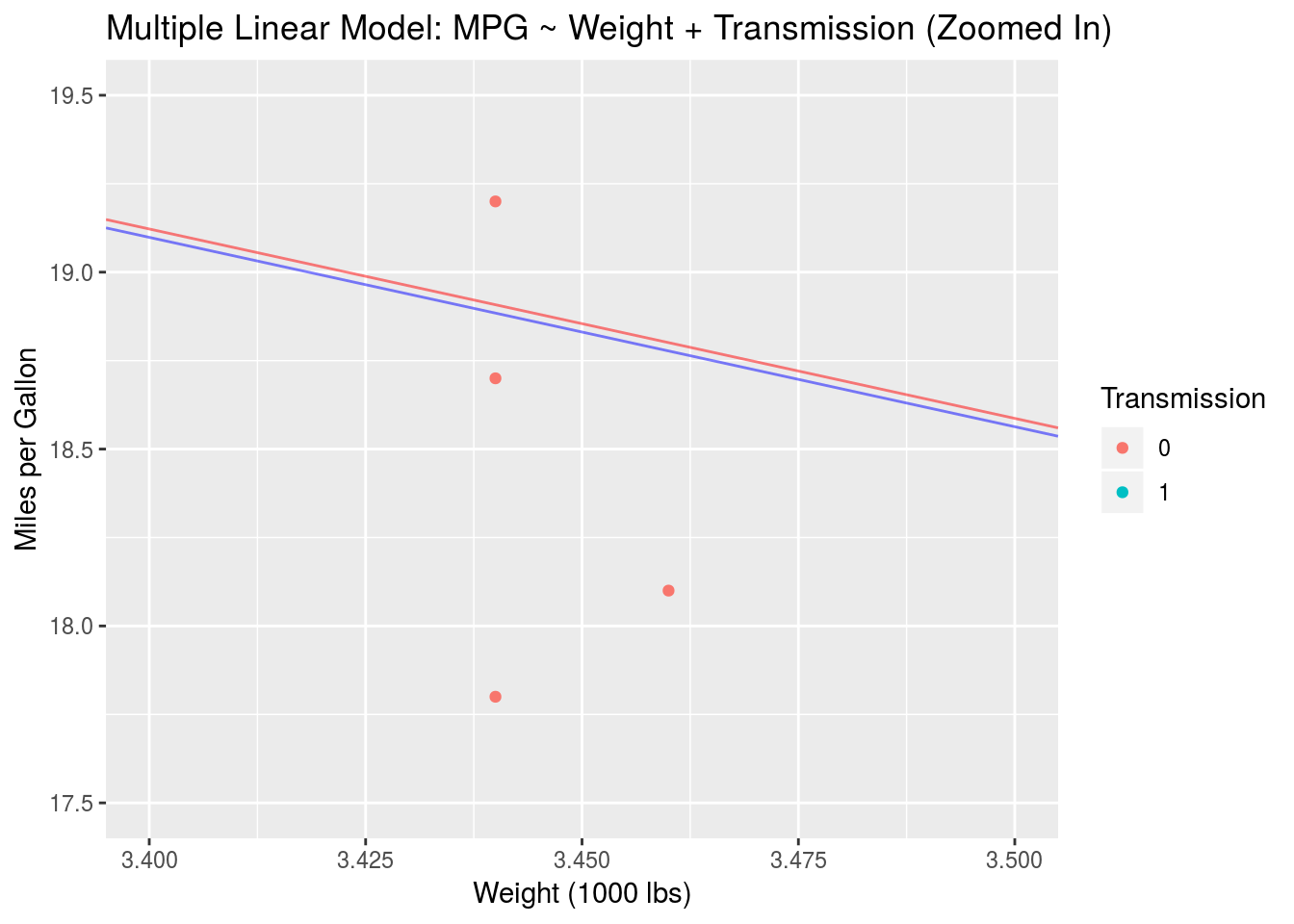
There we go. This is the effect of a multiple linear model with no interactions. In general the trend lines for the two groups don’t have to be so close together. It all depends on the data. In this case we see that, when we impose a fixed slope (using mpg ~ wt + am), the trend lines describing the two groups are basically the same. Next, we’ll look at how adding interactions to our model results in slope variation.
Multiple Linear Regression with Interactions
In the previous Section we examined the use of multiple linear regression to model a response variable in terms of continuous and categorical predictors. We can take this a step further by including an interaction in our model. What does this mean? An interaction describes how a change in one predictor influences change in another predictor. In mathematics this is typically expressed by including a product or more complex term in an equation. A simple product of two variables is the simplest interaction term that we can write down. Consider once again our model of mpg vs. wt and am. This time we will add an interaction:
\[\hat{y} = \beta_0 + \beta_1x + \beta_2A + \beta_3xA\]
The model is as above, with the exception of the new interaction term \(\beta_3xA\). \(xA\) is the product interaction while \(\beta_3\) is the model parameter associated with this interaction.
An important note: In R formula notation, interactions are expressed as wt*am. This includes all terms in the model, i.e. wt*am = 1 + wt + am + wt:am where 1 stands in for the “variable” associated with the \(\beta_0\) parameter, and the colon denotes a product. We can thus write our full interactive model as mpg ~ wt*am.
Let’s run this model through lm() and see what happens.
mpg_int <- summary(lm(mpg ~ wt*am,data=mtcars))
print(mpg_int$coefficients)
## Estimate Std. Error t value Pr(>|t|)
## (Intercept) 31.416055 3.0201093 10.402291 4.001043e-11
## wt -3.785908 0.7856478 -4.818836 4.551182e-05
## am1 14.878423 4.2640422 3.489277 1.621034e-03
## wt:am1 -5.298360 1.4446993 -3.667449 1.017148e-03We have four rows for our four parameters. Again each row corresponds to one \(\beta\) parameter: (Intercept) corresponds to \(\beta_0\) = 31.42, wt corresponds to \(\beta_1\) = -3.79, am1 corresponds to \(\beta_2\) = 14.88 and wt:am1 corresponds to \(\beta_3\) = -5.3. Let’s interpret this, as we did in the previous Section, by examining the different values of the categorical variable am.
When \(A\) = am = 0, we have
\[\hat{y} = \beta_0 + \beta_1x\] which is just our simple model. So \(\beta_0\) describes the intercept when \(A = 0\) and \(\beta_1\) describes the slope associated with \(x\) when \(A = 0\). What happens when \(A = 1\)?
\[\hat{y} = \beta_0 + \beta_1x + \beta_2 + \beta_3x\] \[= (\beta_0 + \beta_2) + (\beta_1 + \beta_3)x\] \[= \beta_0' + \beta_1'x\]
So we actually have a new intercept and a new slope! The new intercept is the same as in the previous Section: \(\beta_0' = \beta_0 + \beta_2\). The new slope is \(\beta_1' = \beta_1 + \beta_3\). Therefore, a simple product interaction like this one causes the slope of \(y\) with \(x\) to change as we move from \(A = 0\) to \(A = 1\). Displaying this on a scatter plot of \(y\) and \(x\), we would have two lines with different intercepts and different slopes.
Let’s take a look.
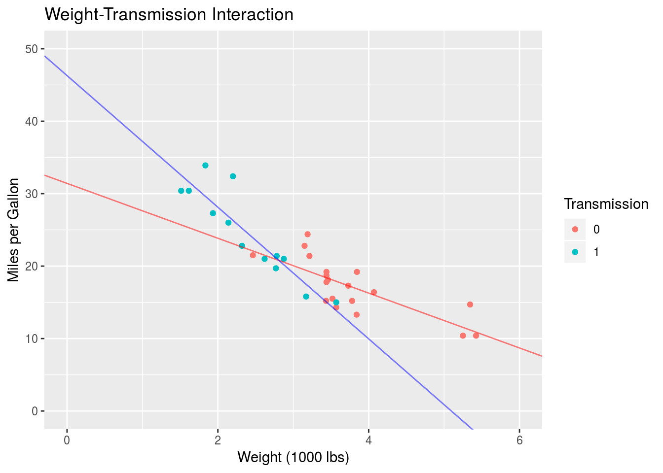
beta0 = mpg_int$coefficients["(Intercept)","Estimate"]
beta1 = mpg_int$coefficients["wt","Estimate"]
beta0_prime = mpg_int$coefficients["(Intercept)","Estimate"] +
                mpg_int$coefficients["am1","Estimate"]
beta1_prime = mpg_int$coefficients["wt","Estimate"] +
                mpg_int$coefficients["wt:am1","Estimate"]

ggplot(mtcars, aes(x = wt, y = mpg, col = am)) +
  geom_point() +
  geom_abline(intercept = beta0,
         slope = beta1,
         col="red",
         alpha=0.5) +
  geom_abline(intercept = beta0_prime,
              slope = beta1_prime,
              col="blue",
              alpha=0.5) +
  coord_cartesian(xlim=c(0,6),
                  ylim = c(0,50)) +
  labs(x = "Weight (1000 lbs)",
       y = "Miles per Gallon",
       title = "Weight-Transmission Interaction",
       colour="Transmission")
Perfect. Compared to the non-interactive model in the previous Section, we see that adding an interaction (and thus allowing the slope of \(y\) with \(x\) to vary between groups) better characterizes the data. If the data was truly not well characterized by an interaction, the equal-slope model of the previous Section would perform just as well as an interactive model of this kind. Of course this would have to be determined by examining the statistics associated with the models.
This concludes the majority of what I wanted to cover. In the next Section I’ll go into some of the heavier mathematical details regarding linear models. Read ahead at your own peril.
Mathematical Embellishments
The previous analysis was focussed on examining linear models built with a continuous and categorical predictor. We’re by no means restricted to this however. We can build a linear model with as many variables as we’d like. As we saw above, the case of one continuous predictor and one categorical predictor can be visualized fairly easily using a scatter plot, where the continous data is mapped to the \(x\) and \(y\) axes and the categorical data is mapped to a colour/shape/style aesthetic. This becomes harder to do when we’re examining models that use multiple continuous predictors, e.g. something of the form
\[\hat{y} = \beta_0 + \beta_1x_1 + \beta_2x_2 + \beta_3x_1x_2\]
Here we have an interactive multiple linear regression with two continuous regressors \(x_1\) and \(x_2\). A practical example of this would be modelling the mpg variable in terms of the wt and horsepower, hp. Let’s plot this in the same way we did above, where the hp variable is mapped to the colour aesthetic.
ggplot(mtcars, aes(x=wt, y=mpg, col=hp)) +
  geom_point() +
   labs(x = "Weight (1000 lbs)",
       y = "Miles per Gallon",
       title = "Fuel Efficiency, Weight, and Horsepower",
       colour="Transmission")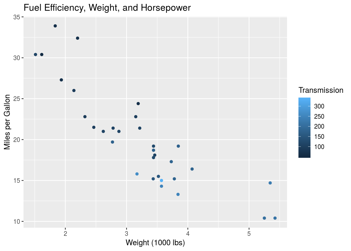
Given the continuous nature of the hp variable, this is difficult to interpret by eye. That doesn’t invalidate the model however, and we can still estimate the optimal \(\beta\) parameters.
mpg_hp <- summary(lm(mpg ~ wt*hp, data=mtcars))
print(mpg_hp$coefficients)
## Estimate Std. Error t value Pr(>|t|)
## (Intercept) 49.80842343 3.60515580 13.815887 5.005761e-14
## wt -8.21662430 1.26970814 -6.471270 5.199287e-07
## hp -0.12010209 0.02469835 -4.862758 4.036243e-05
## wt:hp 0.02784815 0.00741958 3.753332 8.108307e-04The rows in this table still represent the \(\beta\) parameters in the model, as before, but it is much harder to interpret this result in the context of a scatter plot of mpg vs. wt. We can’t just set hp = 0 and hp = 1 as we did previously. The equivalent here would be setting hp to an infinite number of incremental values. This isn’t the right way to think about this. This sort of brings us face to face with what the multiple linear model is actually saying. Consider again simple linear regression:
\[\hat{y} = \beta_0 + \beta_1x\] This is clearly the expression for a line. The variable \(y\) is modelled as a linear function of \(x\). As we know, we can plot this easily on a two-dimensional space, where \(y\) and \(x\) form the axes. Moving to multiple regression, we have
\[\hat{y} = \beta_0 + \beta_1x_1 + \beta_2x_2\]
In Sections 5 and 6, we interpreted this model within the context of the scatter plot of \(x_1\) and \(y\). With \(x_2\) as a categorical variable, this allowed us to interpret \(\beta_2\) as the difference in intercept values on this scatter plot. Mathematically, however, this expression describes a two-dimensional plane characterised by the variables \(x_1\) and \(x_2\). We see that the intercept of the plane is \(\beta_0\), i.e. the value of \(y\) at which both the parametric variables are 0. Moreover, \(\beta_1\) is the slope of the plane with respect to \(x_1\), and \(\beta_2\) is the slope of the plane with respect to \(x_2\). Specifically,
\[\beta_1 = \frac{\partial\hat{y}}{\partial x_1}\]
and
\[\beta_2 = \frac{\partial\hat{y}}{\partial x_2}\] We can visualize this two-dimensional plane in a three-dimensional space, where the third axis is represented by the \(y\) variable. You can do this easily by grabbing a piece of paper, or preferably a rigid flat object, and orienting it in front of you in real space. You can imagine the \(y\) axis as the vertical axis, and the \(x_1\) and \(x_2\) axes as the horizontal axes. The idea of a flat plane in a multi-dimensional space extends to any number of predictors in our model, provided that the model is non-interactive. Given \(N\) predictors \(\{x_1, x_2, ..., x_N\}\), a model of the form
\[\hat{y} = \beta_0 + \sum_{a=1}^N{\beta_ax_a}\]
describes a N-dimensional hyperplane embedded in a (N+1)-dimensional space. Crazy. This is undoubtedly true of continuous variables, but is a little bit more nuanced for a categorical variable. Going back to our model of mpg vs. wt and am, we can still imagine this in a three-dimensional space. The axes of the space are mpg,wt and am, but notice that we aren’t actually dealing with a plane in this case, since am only takes on binary values. Rather we are dealing with two different lines embedded in this three-dimensional space. One line will occur at am = 0, while the other occurs at am = 1. Given this context, we can re-interpret the scatter plots from Section 5 and 6. Here is the scatter plot and model from Section 6:
Within the proper context of a three-dimensional space, this two-dimensional plot is actually the projection of the binary am axis onto am = 0. Imagine the red line existing in your computer screen and the blue line actually existing outside of your computer screen, closer to you. I’ve used the interactive model here since the plot is nicer than that for the non-interactive model, but this leads us into a discussion of interactions with continuous variables.
Examining the plot above, you might already guess where this is going. Let’s consider a model with a simple product interaction of two continuous variables, like the one at the beginning of this Section:
\[\hat{y} = \beta_0 + \beta_1x_1 + \beta_2x_2 + \beta_3x_1x_2\]
We saw that when \(\beta_3 = 0\), the model describes a two-dimensional plane in three-dimensions. What does the interaction do to this plane? Notice that the product interaction is actually a second-order term in the expression for \(\hat{y}\). From univariate calculus, we know that second order terms are responsible for the curvature of a function. The same is true in multivariate calculus. The result is that the plane is no longer a plane, but rather a curved two-dimensional surface (or manifold, if you want to be fancy), embedded in a three-dimensional space. The nature of this curvature is unique as well, since it involves coupling between the two regressors, i.e. the surface changes in the \(x_1\) direction as we move along the \(x_2\) direction, and vice versa. This is apparent when looking at the partial derivatives:
\[\frac{\partial \hat{y}}{\partial x_1} = \beta_1 + \beta_3x_2 \]
and
\[\frac{\partial \hat{y}}{\partial x_2} = \beta_2 + \beta_3x_1 \]
We can further characterize the modelled surface if we’d like. For instance, since there aren’t any single-variable higher order terms, e.g. \(x_1^2\), \(x_1^3\), etc., we know that, for a given value of one of the predictors, the response variable varies linearly with the other predictor. You can verify this by setting one of the predictors to 0. Moreover since there are no terms of order higher than 2, we know that this surface has a constant curvature. This can be verified by computing the 2nd order partial derivatives. These steps maybe aren’t necessary, but they give us an idea as to how to interpret the effect of a simple product interaction.
In general, a multiple linear regression with \(N\) predictors and various interactions between those predictors will describe a curved surface or manifold in a (N+1)-dimensional space. The more complex the interactions between the predictors, the more elaborate the surface will be. In analogy to Section 2 such a surface will be characterized by a function, \(f\), so that
\[y = f[\{x_a\}_{a=1}^N] + \epsilon\] for a response variable \(y\) and predictors \(x_a\). Estimating complex surfaces such as these is the purpose of most statistical and machine learning techniques.